We in the IT Division set out to create an end-of-year infographic showcasing key IT metrics, such as the number of support tickets resolved and network attacks blocked by cyber security systems. We saw the project not only as a way to highlight the IT Division’s accomplishments, but also as an opportunity to experiment with AI.
We started with Gemini’s advanced AI-powered image generation and editing model, Nano Banana Pro with the prompt:
“We are the IT Division at Berkeley Lab preparing an “IT by the numbers” holiday card to my peers and Lab leadership. Please make this visually interesting. Please create a holiday-themed infographic with these statistics in these categories…” and pasted a list of different statistics for each IT department.
It netted the following image:
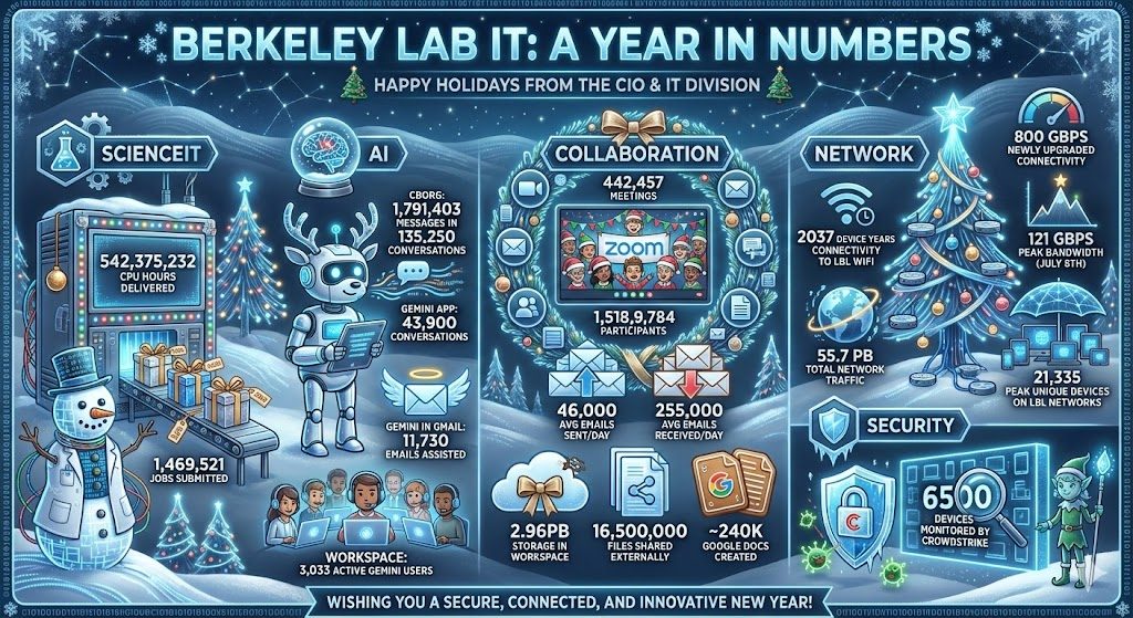
While this image is very charming with the lab-coated snow man and reindeer-bot, it didn’t incorporate all of the statistics we wanted and we also wanted a different title. Knowing Nano Banana Pro is particularly good at making small, targeted changes we used the following prompt:
“Please change the title to “Berkeley Lab IT: 2025 By the Numbers”. Please change the subheading to “Happy Holidays from IT Division”.
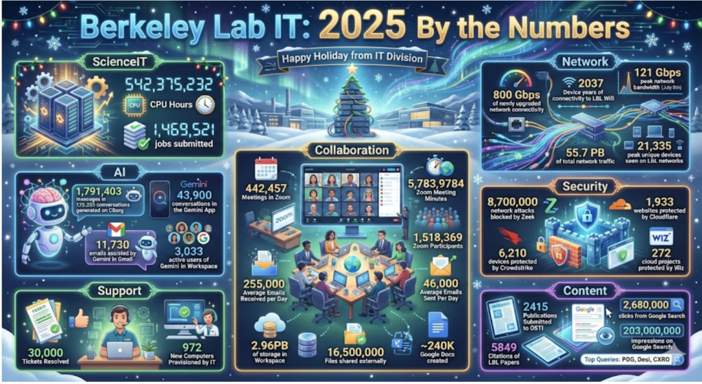
We continued to give minor feedback over a few more iterations until we noticed a common issue in AI image generation: text drift.
Text drift in AI image generation refers to the tendency for text embedded in images to degrade, change, or become incorrect as the model generates or iterates on an image. It can show up as misspelled words, inconsistent typography and text changes. You can see the text drift in the infographic version below featuring several issues such as: CBORG being changed to CBO6, July 5th turning into July Sth, and the Security Section completely disappearing.

Because the text drift changed the information so much, we decided to start again, taking our learnings to create the following prompt:
“We’re the IT Division at Berkeley Lab preparing an “IT by the numbers” holiday card to my peers and Lab leadership. Please make this visually interesting. Title: “Berkeley Lab IT: 2025 By the Numbers”. Please include “Happy Holiday from IT Division”. Please create a holiday-themed infographic with these statistics in these categories:…”
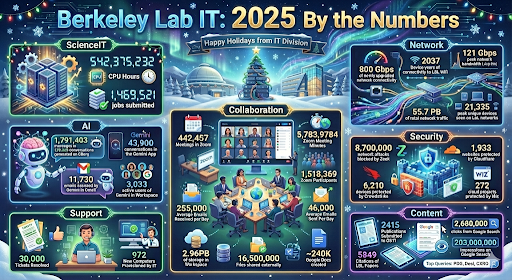
Nano Banana Pro created the following colorful image:
Again, we continued to tweak with this version, however with each iteration, the text drift continued to increase, while other features improved, such as adding Lab specific buildings. The final version’s text drift was so bad changing “Zoom participants” to “Zoem Participonts” and “Citations of LBL Papers” to “Citations of LBL Fapers” that we could not use it.
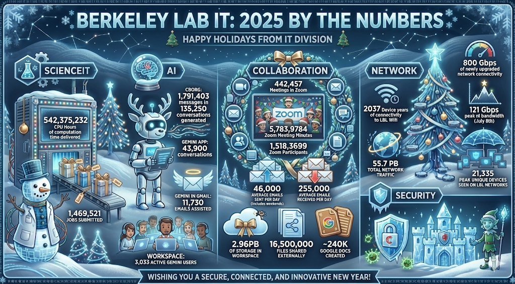
We decided on a different approach: what if we downloaded and re-upload the first version and asked it to make changes. Would AI cooperate? We used the following prompt with the original photo:
“We’re the IT Division at Berkeley Lab preparing an “IT by the numbers” holiday card to my peers and Lab leadership. Please make this visually interesting. Title: “Berkeley Lab IT: 2025 By the Numbers”. Please include “Happy Holidays from IT Division”. Use the attached picture as inspiration. Please create a holiday-themed infographic with these statistics in these categories:… (with some new statistics and categories added)”
Although Nano Banana Pro did create the following image, there were some serious issues, such as the Content section disappeared and Security section turned into just an ice castle with a happy elf.
This experiment highlights an important takeaway for anyone using AI to create data-driven visuals: always review AI-generated infographics carefully before sharing them. While tools like Nano Banana Pro can dramatically speed up design and ideation, text drift can alter critical information even with just one iteration. A final human review ensures that the numbers, labels, and messages remain accurate, preserving trust and clarity while still benefiting from AI’s creative power. And remember, the Creative Services Office (CSO) is an excellent resource for infographics like this. CSO provides both strategic design expertise and human review, ensuring polished, accurate visuals—without the risk of text drift.

